Content Discovery Redesign for Yes
Client: Yes
User Experience | User Interface | App Redesign | Streaming Platform | Study Project
Overview
"yes+" is a leading Israeli streaming platform by yes. The goal of this UX/UI redesign was to enhance the content discovery experience — helping users find what to watch quickly, effortlessly, and enjoyably. I analyzed the existing app, identified friction points in navigation and hierarchy, and proposed a smoother, more personalized experience.
Main Goal
To create a natural, fast, and focused user flow for discovering new content. The redesign aimed to improve clarity, reduce cognitive load, and allow users to reach desired shows or movies in fewer steps.
The Problem, Challenge
The existing discovery flow was functional but overloaded, too many categories, unclear hierarchy, and repetitive elements. Users struggled to understand where to find new content, and navigation between sections wasn’t intuitive.
The Solution
The new design introduces a clean hierarchy with clear visual separation between categories, personalized carousels, and faster navigation. I reorganized the layout, simplified the filtering flow, and added a more intuitive “Sort & Filter” overlay inspired by modern streaming apps like "Netflix" and "Apple TV+".
Existing Design vs. New Design
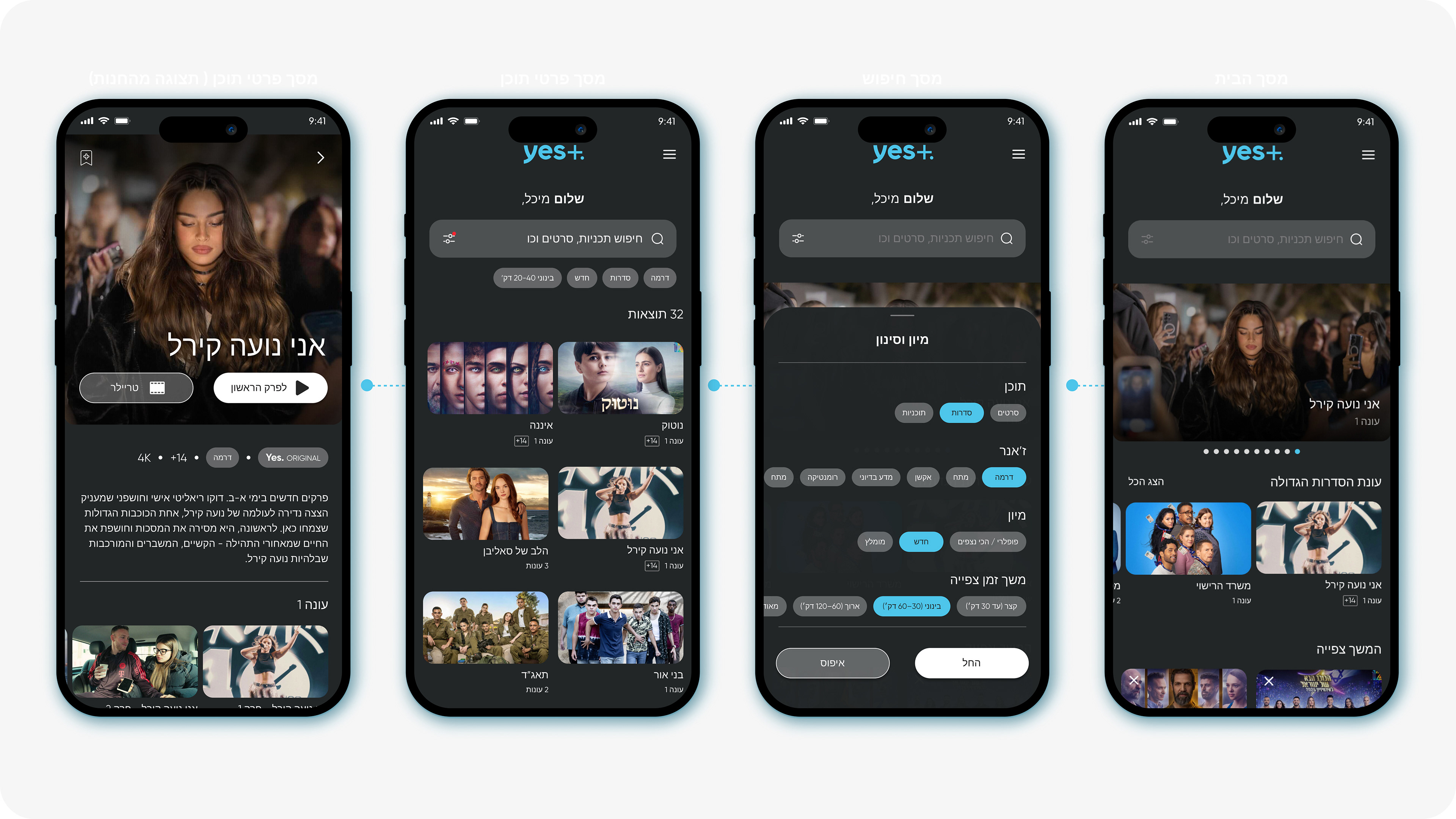
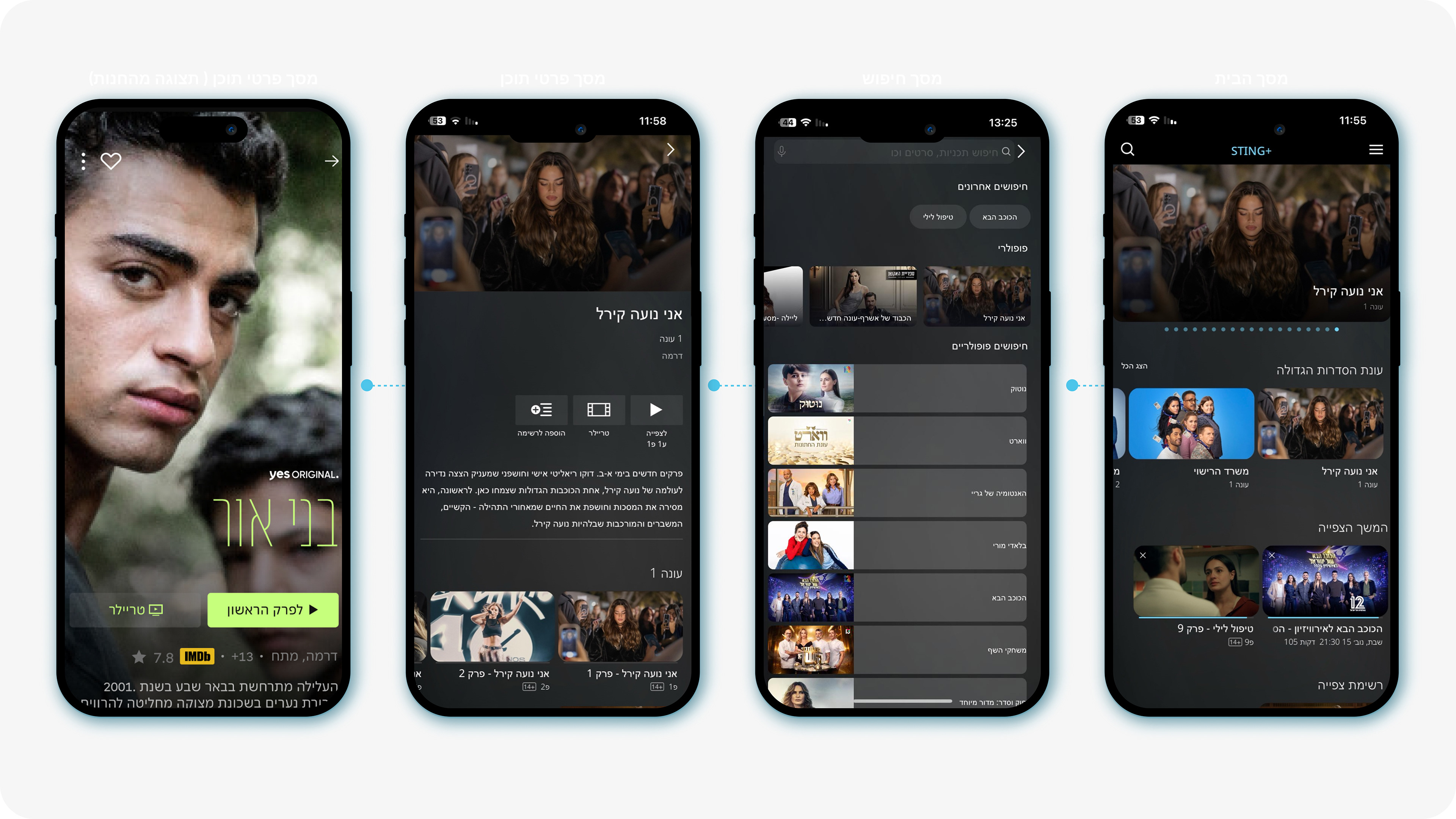
Existing Design - "Home screen"
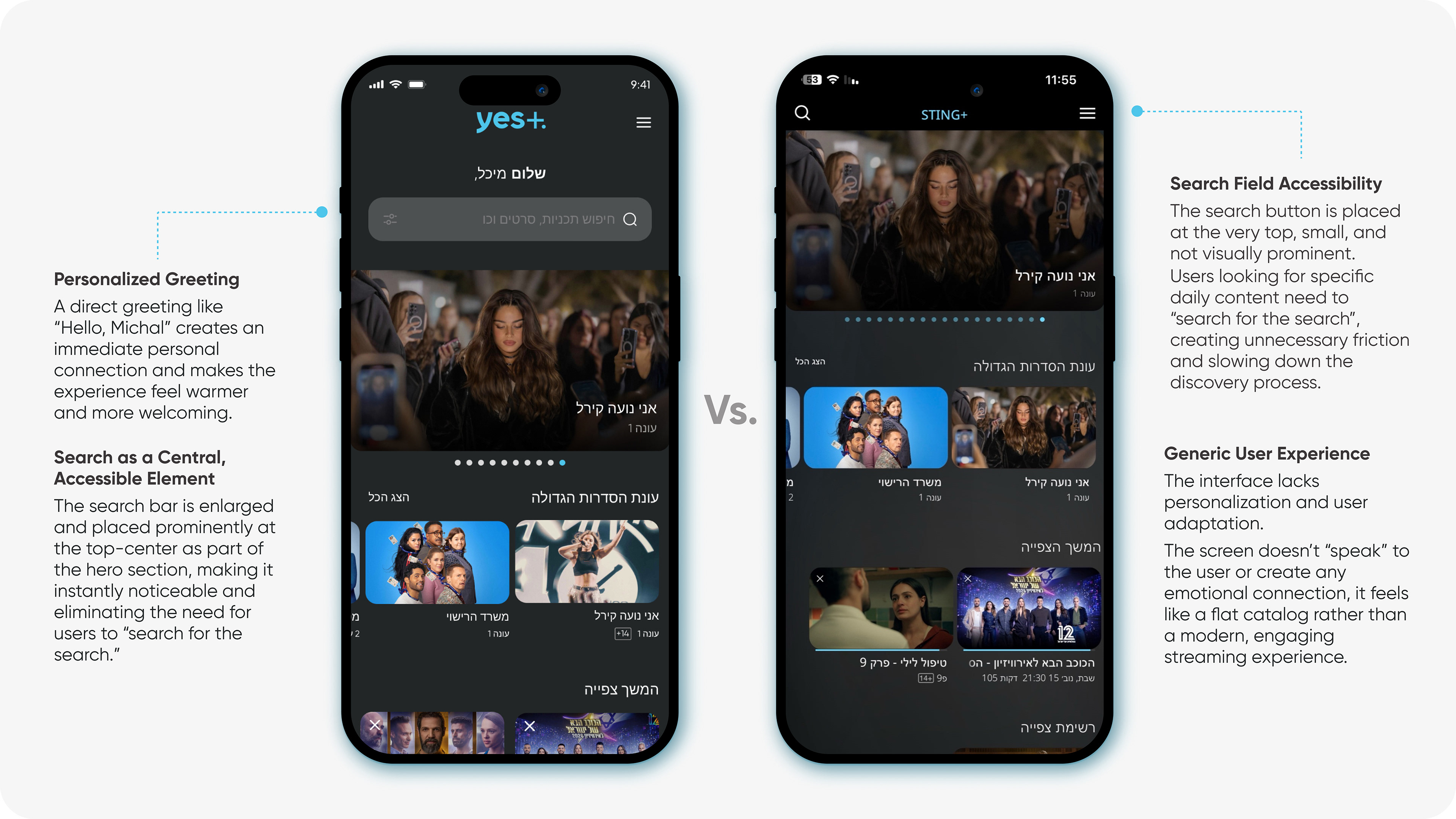
The existing home screen presents several usability challenges.
The search field is placed at the very top of the screen, small and visually understated, making it difficult to notice. Users who arrive with a clear intent to search must essentially “search for the search”, creating unnecessary friction and slowing down the discovery process.
In addition, the overall experience feels generic and lacks personalization. The interface doesn’t adapt to the user or create any emotional connection, resulting in a flat, catalog like layout rather than a modern, engaging streaming experience.
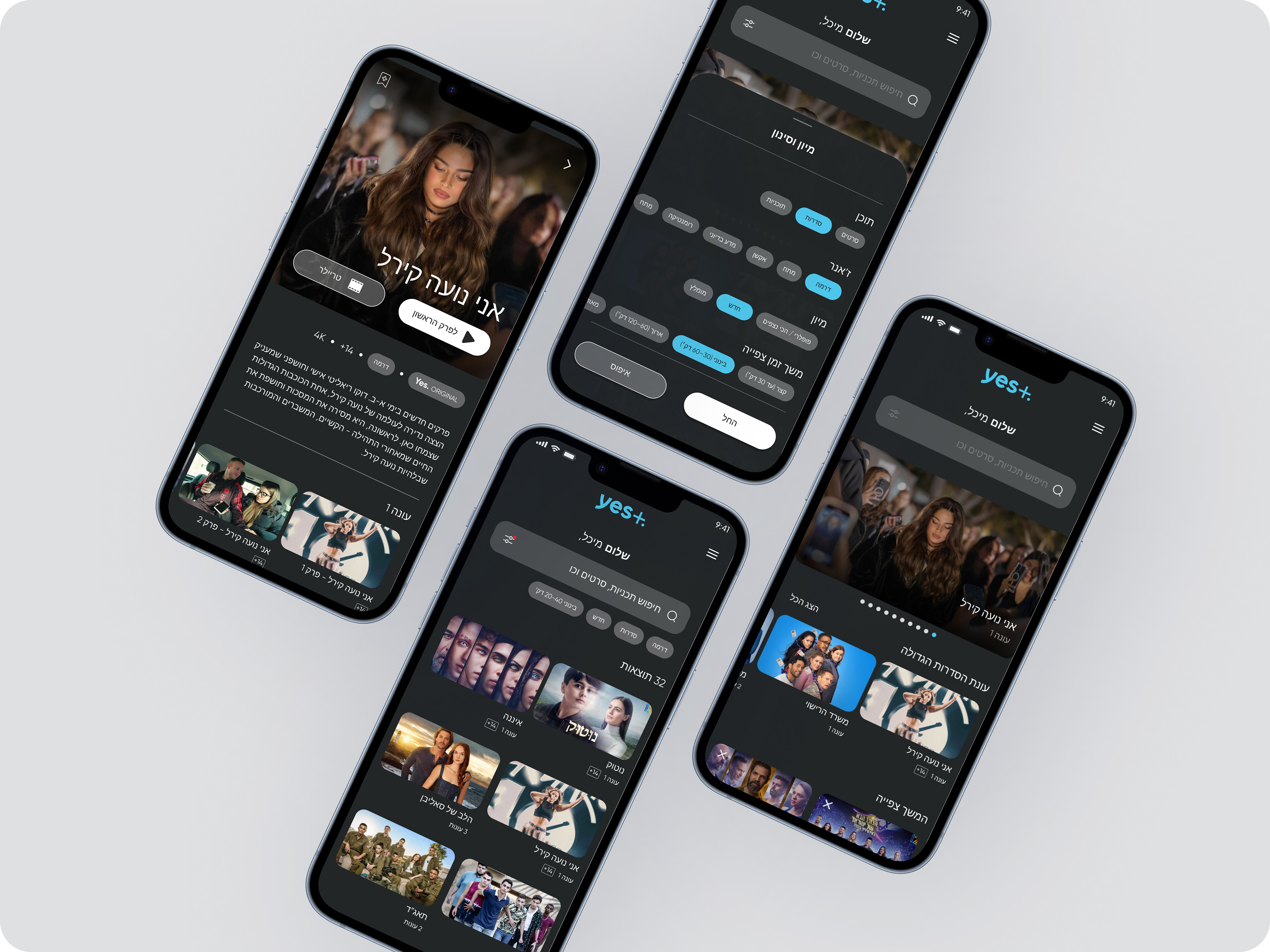
New Design
A personal greeting such as “Hello, Michal” creates an immediate emotional connection with the user. This level of personalization enhances the sense of relevance, makes the interface feel more welcoming, and strengthens user engagement from the very first moment.
The search bar becomes a central, highly accessible element.
It is enlarged, highlighted, and positioned prominently at the top, center of the screen as part of the hero section, ensuring that users no longer need to search for the search.
This creates a natural starting point for anyone looking to quickly find something to watch.
It is enlarged, highlighted, and positioned prominently at the top, center of the screen as part of the hero section, ensuring that users no longer need to search for the search.
This creates a natural starting point for anyone looking to quickly find something to watch.
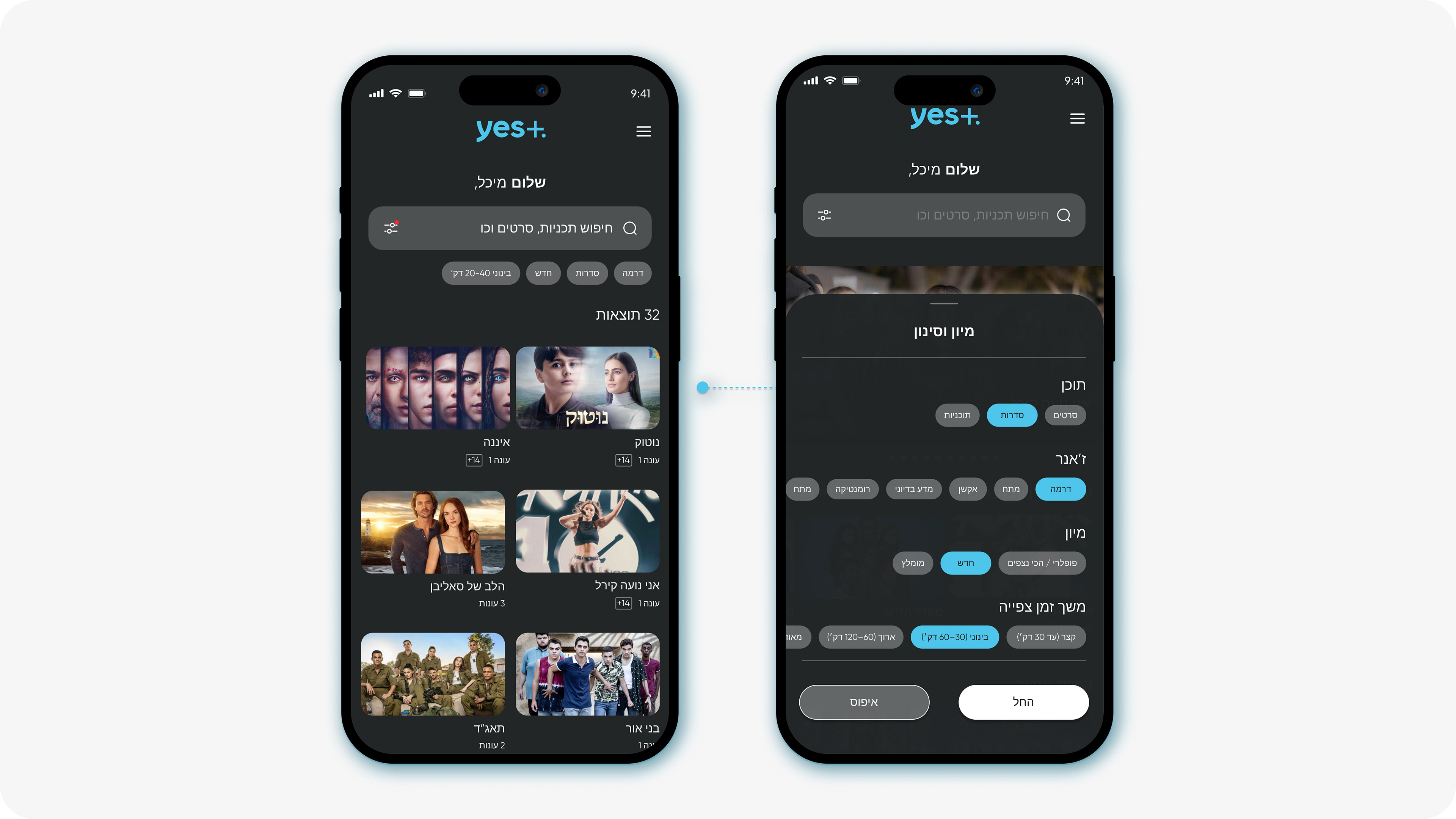
Existing Design - "Search screen"
The existing search screen offers a limited experience with no filtering or sorting tools. Users cannot refine results by genre, category, or viewing duration, which forces them to scroll through many carousels to find relevant content. Popular search terms lack clear hierarchy, and titles are not visually readable, making quick discovery difficult and inefficient.
New Design
The existing search screen offers a limited experience with no filtering or sorting tools. Users cannot refine results by genre, category, or viewing duration, which forces them to scroll through many carousels to find relevant content. Popular search terms lack clear hierarchy, and titles are not visually readable, making quick discovery difficult and inefficient.
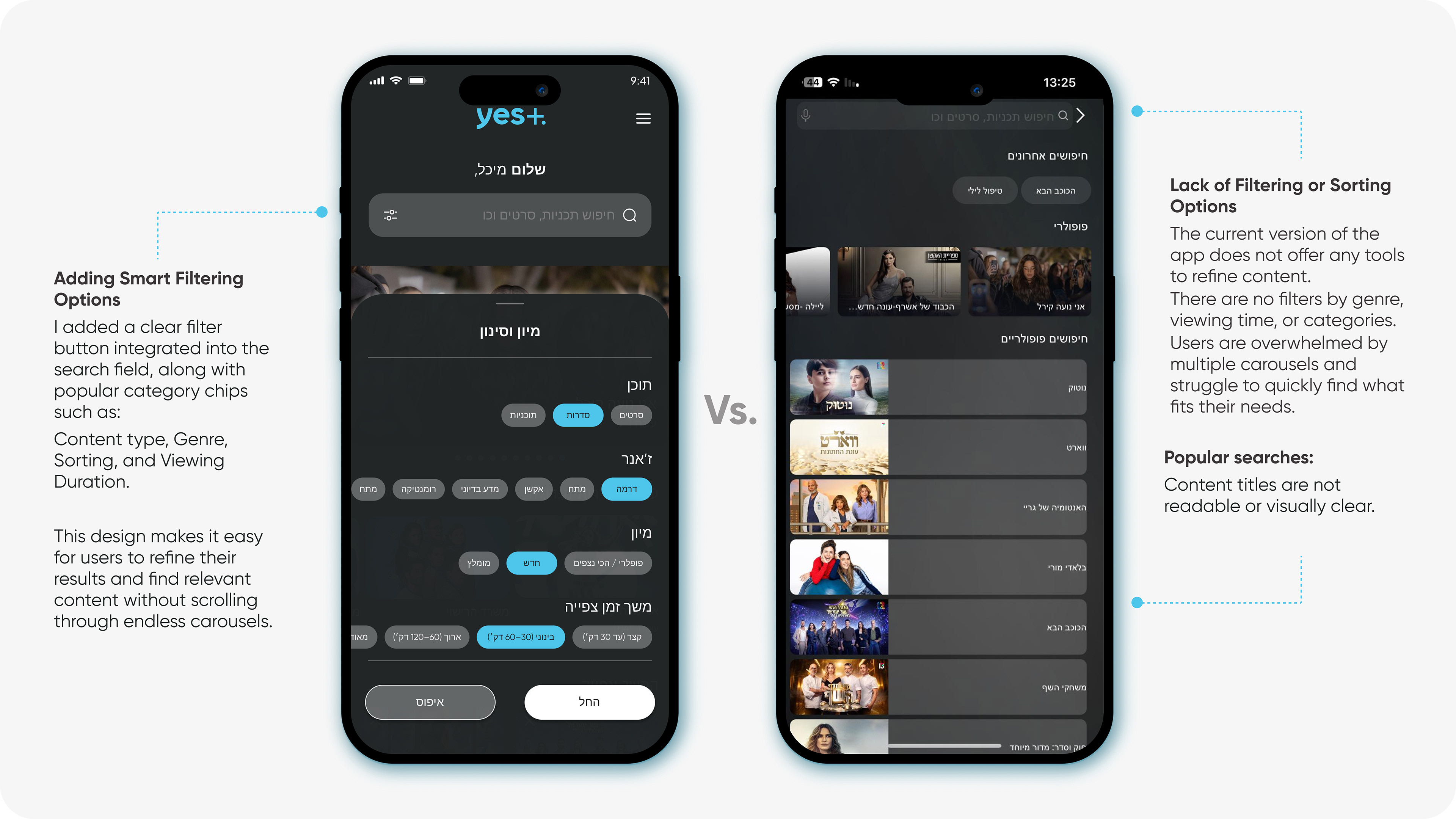
Search Result & Filtering
The clean visual layout, allows users to quickly scan and understand their search results, even within a large list. Smart filtering options replace endless scrolling, helping users refine content instantly and focus only on what matches their needs.
This structure creates a guided experience, the system feels supportive, intuitive, and actively helpful in leading users to the right content.
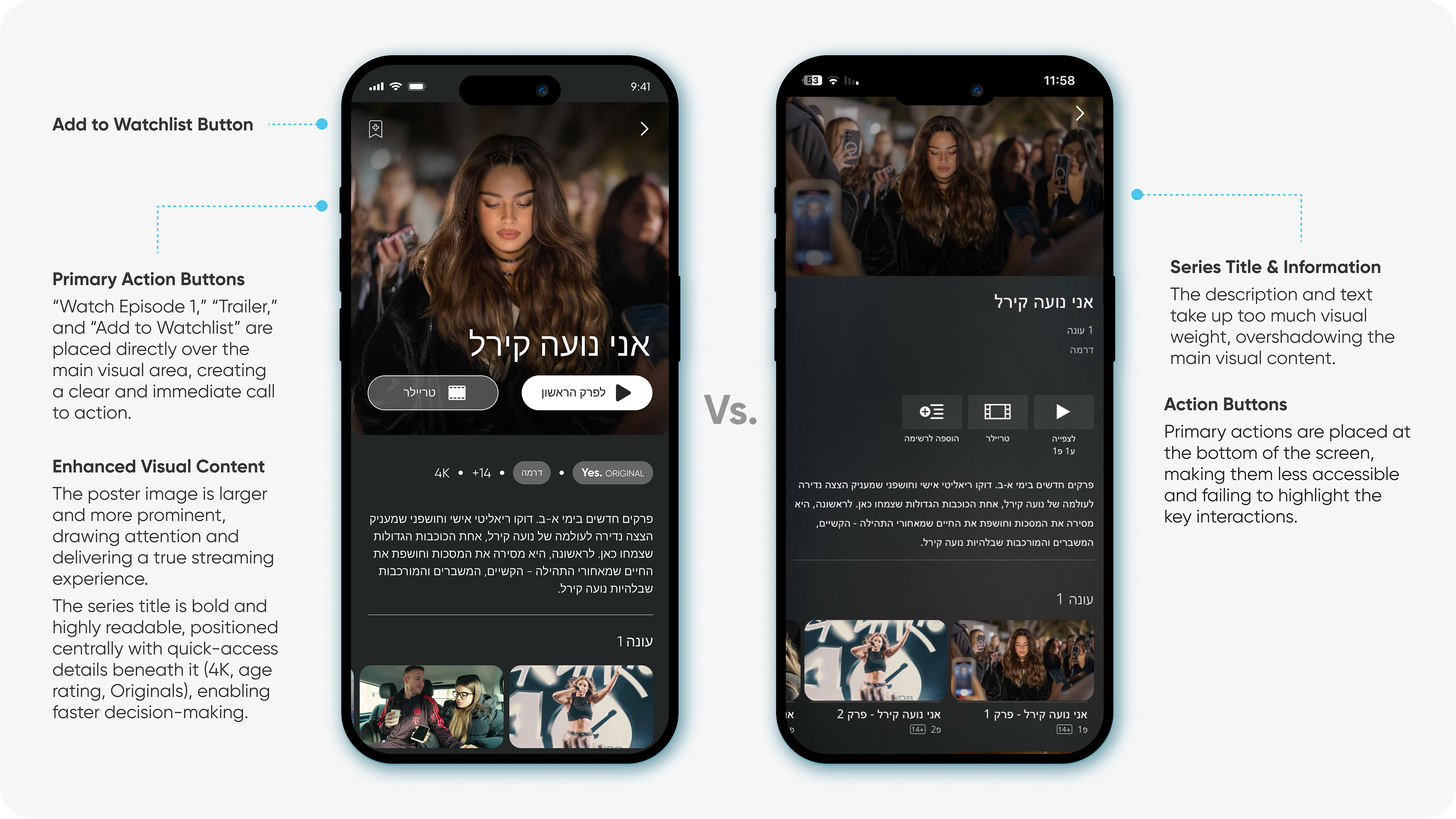
Existing Design - "Content Details Screen"
The series title and description take up too much visual weight, pushing the actual content visuals into the background. Action buttons are placed at the bottom of the screen, making them less accessible and not emphasizing the primary user actions.
The “Add to Watchlist” button is also less noticeable, reducing the likelihood of interaction.
The “Add to Watchlist” button is also less noticeable, reducing the likelihood of interaction.
New Design
Primary action buttons, “Watch Episode 1,” “Trailer,” and “Add to Watchlist”, are now placed directly over the main visual area, creating a clear and immediate call to action.
The poster image is larger and more prominent, drawing attention and delivering a true streaming platform experience. The series title is bold, centered, and highly readable, with quick access details beneath it (4K, age rating, Originals) that help users make faster and more confident viewing decisions.
The Result
A faster, cleaner, and more engaging discovery experience. The redesign reduces cognitive effort, enhances usability, and helps users connect with the right content faster, ultimately increasing engagement and satisfaction.