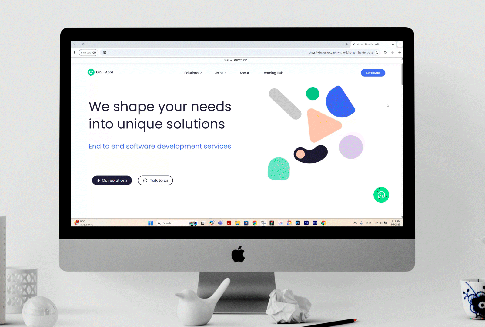
New Website for Gini-Apps
Client: Gini-Apps
Collaboration with: Adi Weiss
User Experience | User Interface | Product Design
Overview
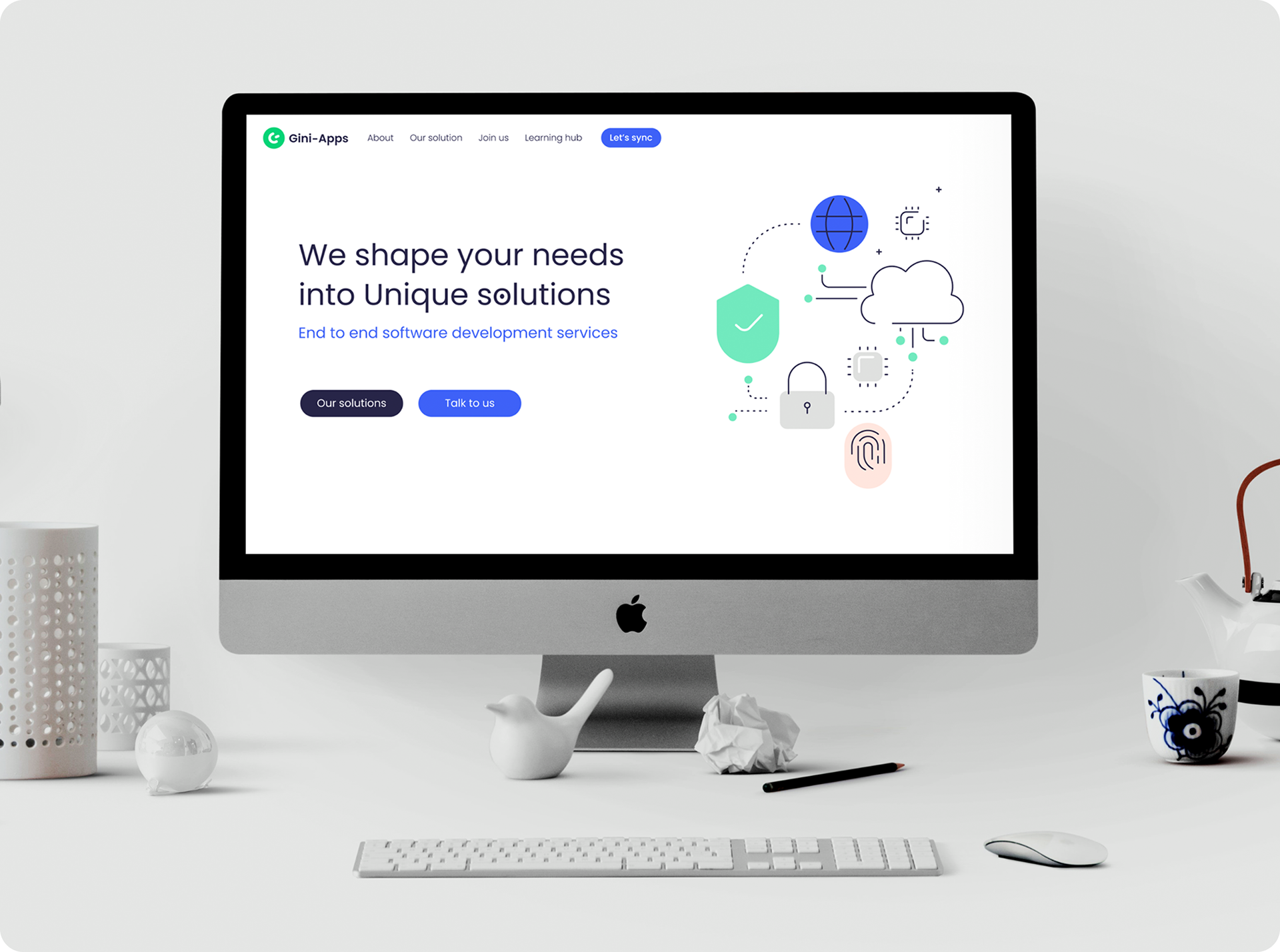
The new Gini-Apps website has undergone a complete redesign, including brand refresh, improved user experience, and a modernized interface. The goal was to transform the website into a powerful and precise marketing tool that highlights the company's innovation and differentiates it from competitors. The upgrade includes a more intuitive navigation system, a clean and modern design, smart animations, and custom illustrations, along with new features such as Outsource and Placement services.
Main Goal
To create a website that speaks a modern, professional, and unique language while enhancing user experience and presenting information in a clear and focused way. The new website is not only visually appealing but also offers an interactive browsing experience that drives user engagement, positions Gini-Apps as a leading development company, and strengthens connections with potential clients..
The Problem
The old website did not fully reflect the company's growth and innovation. While the user experience was clear, the design felt outdated, and the marketing message was not strong enough.
The Solution
A modern design with an intuitive interface, smooth navigation, and a clear visual language that strengthens the brand. Animations, illustrations, and strategic calls to action transform the website into a more effective business tool, positioning Gini-Apps as a leading company in its field.
Existing Design vs. New Design
Existing Design
The existing design of Gini-Apps was stable and clear, but it needed a refresh and update to reflect the company’s growth and innovation. While it contained important functional elements, it wasn’t visually modern enough, requiring an upgrade in branding, colors, and typography to convey professionalism and freshness.

New Design
The redesigned Gini-Apps is modern and professional, featuring updated colors, intuitive navigation, custom illustrations, and subtle animations. New features like Placement, Outsource, and Learning Hub enhance the user experience and expand service offerings.
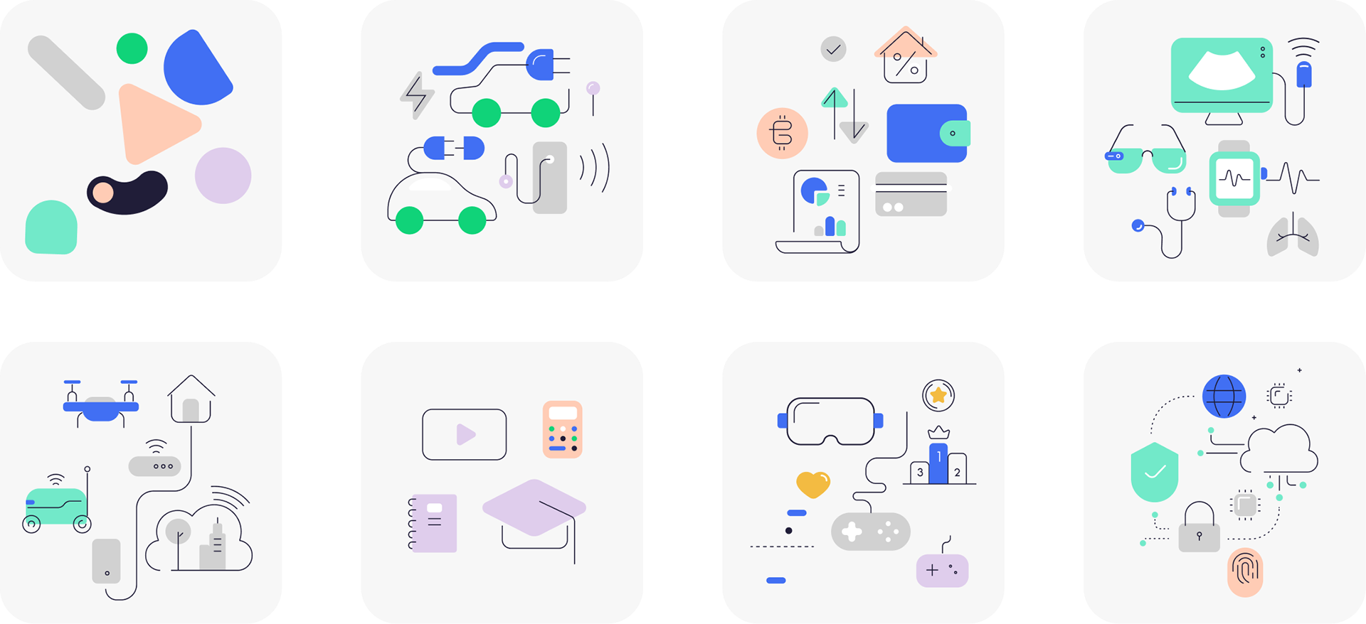
Main Animation and Changing Shapes
At the top of the page, a live animation displays geometric shapes shifting into new forms and colors—symbolizing innovation, movement, and flexibility. It adds a unique design character and brings the site to life.

Central Cards
In the center of the page, interactive cards clearly showcase the company’s services using icons, brief text, and subtle animations.

Shaping Tools
This section creatively presents the tools and solutions the company offers—covering design, development, and strategy.

Selected Projects
Displayed in a grid format, with hover effects that visually highlight the company’s previous work and create a strong visual connection with visitors.

Clients (Logos) & Testimonials
A moving banner features client logos—building trust, establishing credibility, and showcasing industry experience.
Client reviews are presented in a clean design with smooth transitions, reinforcing professionalism and reliability.